luisredin97
New member
Hi!
First I want to congratulate whoever is in charge of the localization, so far it's really good.
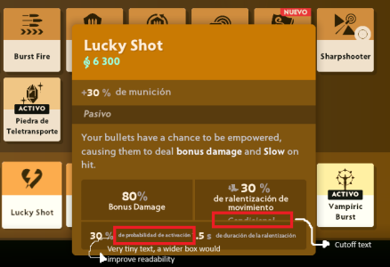
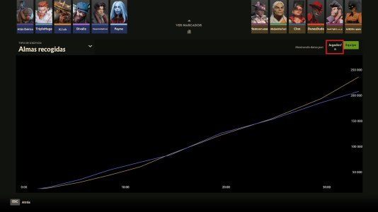
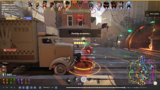
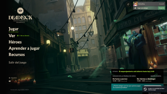
The issues I found with localization have to do more with the UI of the game not being properly adapted for translated text.
Since Spanish tends on average to have longer sentences than English, there are many texts which get cut, look a bit unappealing or are pretty hard or nearly impossible to read.
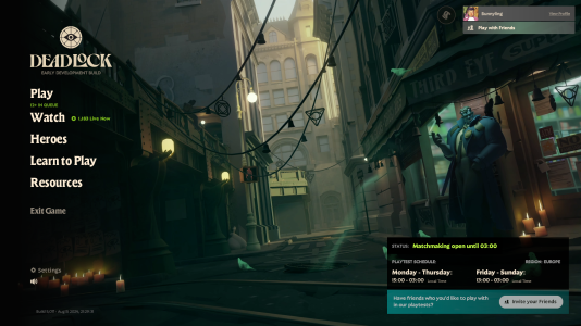
I've attached some screenshots with some of these issues that I've encountered.
Thanks and keep up the good work!
