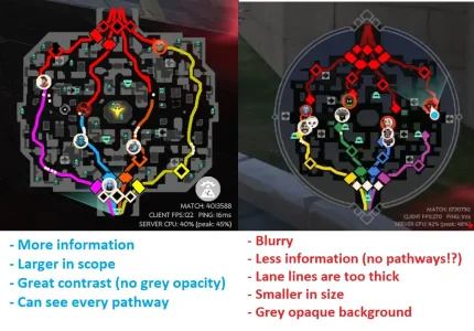
New minimap/heroes on map, camp icons, and constant freezes

My complaint about the new mini-map is while I like the general look of it, I personally hate the jungle camps being this green glow. Even more so for learning or getting quick info. Yea you eventually learn the T1/T2/T3 camps, but teaching new players or learning it feels awful. The icons told you the exact location to farm and especially on sites like back left and back right T2 pairs, locating the camps quickly could be annoying.

For a better icon choice I actually recommend using the icons for the Spirit items, Mainly Boundless Spirit. A T1 camp uses only the middle, T2 using mid and right spirits and all three of them for a T3 camp.

As far as enemy indicators, my main issue was the fact the art on the minimap differed from the art up top for *some* characters. Now you need to learn which icon now pairs with the one up top for the entire cast.
 
as a new player, I can say a new map so awful because u just being blind with it, u lost all info what u had before, what hero at which lane, u just dont understand a icons, also green bright instead of markers as in DOTA is terrible, whole game I just cannot found even 1 camp to farm. and i guess it should be transparent as well.
 
New minimap/heroes on map is atrocious. Please revert
New camp icons/indicators are really bad as well. Reverting would be great
I played a 30 minute game and had about 3-4 scenarios where I hitched/froze really hard for about 5 seconds each.
The new icons don't even look like the heroes. I don't understand this change.
 
feels lot cleaner but maybe when u press additional hot key it can give detailed map like earlier like how they have it in games like path of exile. also wish they have option to switch minimap sides. i am so used to my eye glancing to bottom left side due to years of playing dota. its so hard for me to relearn that and wish we have switch minimap option like in dota 2.
 
The map shouldn't be crammed into a circle, it just makes it smaller and adds dead space on the screen. Deadlock doesn't have an oval map like league, it should stay square.

The contrast is really frustrating. I really don't understand cutting out all the tunnels, now I cant tell if someone is on top of or in a building.

Don't get why the icons are the minimap are different than the top of the screen portraits, just adds seems unnecessary.
 
I think they should at least leave the option to use the old map instead of just outright deleting it. I'm partly colorblind, and now it takes me awhile to count how many camps are up in each lane because it almost all melts together now, symbols are much easier to count at a glance.
 
icon changes are neat and have style, definitely better than just a png of their model

the camp changes are weird, and the map is much harder to read (its pretty cramped at times) and less detailed

i love the style of it but there is definitely a comfortable middle ground between style and functionality (i.e. the old and new minimap) that could be found
 
I dont mind the new icons like some, but the overall map is very bad. It sort of gives me eye strain, its has less information but yet feels more busy. Jungle camps is just a straight nerf, not sure what the thought process behind that was.
 
the jungle camp icons and bounce pad removal make it harder to explain to my friends too. Being able to say "this icon is a bounce pad and these are different camps" was simpler than describing the buildings and trying to have them distinguish between a green glow.
 
Putting my vote in that this new minimap is a serious downgrade from the previous mini map.

- Icons using different art than what players are already introduced to is an odd choice and I find it takes me longer to identify heroes (save for heroes that had illegible icons already, but heroes like Abrams and Shiv were clear before).
- Identifying creep camps on the new minimap strains my eyes and in many cases I improperly determine an exhausted camp to be active.
- Loss of sub-paths makes navigating the map even more confusing than it already was.
 
The new minimap is ok. And the new icons are fun up close in detail but when the new art icons for the characters are on the map and shrunk down, they don't look great. They're crunchier and more pixelated, making it hard to tell who's on the map. Going back to the old map character icons that share the portraits at the top would be for the best, because it helps quick thinking when taking a quick peep at the map instead of trying to decern who it is with a crunchy image. Also Ivy portrait's rat teeth :( (hope she's staying a gargoyle)
 
The new minimap changes are a buff to the veteran players and a big negative to those who are still relying on learning the routes and figuring out what minion camp is where, and how strong said minion camp is. Me being the latter, a new player, I heavily relied on the minimap to just get around.

Please revert the changes, or at least allow us to toggle between the different types of minimaps. Even simply a toggle on how the camps look would be fine.
 
Back
Top