Played a lot of Deadlock when the early playtest first went live. Loved the game but took a long break.
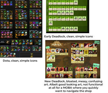
Just recently came back and the first thing that bothered me was the new shop UI and item icons. The artstyle looks good but its not at all functional.
The design is too bloated and confusing. MOBA's should have simple icons in a shop because its part of the gameplay to be able to quickly navigate the shop
to waste as little time as possible. This new design does the opposite.
I realize that all the players who have continuously played since the start dont have an issue with this, they know where everything is. But I now have the perspective of a returning player, so I can see things how they would be for a new player to a degree. Any new player in Deadlock is going to find this shop extremely confusing and hard to navigate.