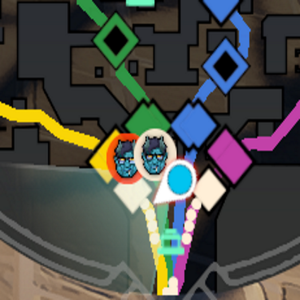
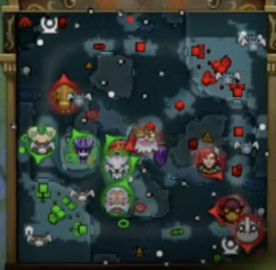
Hero icons on minimap

ANDY SALAD

New member
The new hero icons make it extremely difficult to tell who is in any given lane on the map.

The old hero icons were better and made it easier to distinguish who was where on the map.

Please revert back to old hero icons!
 
I think removing the outer circle and increasing the actual portrait size would help with this, currently these portraits are stylized in a way that the don't look much like the character they are, which could be fine but they are still quite detailed and at this small size they are noisy

1726239083296.png
At least with the old portraits they are icons that users had seen in other UI elements, this new ones are unique to the map and golden budda pickup UI


Also the marker for my player is way too huge and often covers creeps and camps, I think that could be much smaller without effecting it's usability
 
The dota 2 minimap icons are infinitely more readable than the deadlock ones, either old or new. I hope they switch to using distinctive silhouette style icons soon instead of circles.

1726240414848.png
 
Back
Top