Install the app
How to install the app on iOS
Follow along with the video below to see how to install our site as a web app on your home screen.
Note: This feature may not be available in some browsers.
You are using an out of date browser. It may not display this or other websites correctly.
You should upgrade or use an alternative browser.
You should upgrade or use an alternative browser.
HEALING NOVA IS T3 ITEM BUT HAS T2 BACKGROUND ON ICON
- Thread starter souloms
- Start date
Playwithme
New member
Yes, i saw it too
gibnewitems
Well-known member
Honestly, it's fine. The backgrounds aren't even consistent in the tier 2 category if you look closely.
But all t3 items have same style w dark bg. And nova stands out a lot. Look at pidjan's screenshot. Ugly afHonestly, it's fine. The backgrounds aren't even consistent in the tier 2 category if you look closely.
Playeroth
Well-known member
its definitely not a bug but will receive eventual changes. notice that they are updating other icons, eventually healing novaHEALING NOVA IS T3 ITEM BUT HAS T2 BACKGROUND ON ICON
gibnewitems
Well-known member
That's not a general rule. Just take a look at other item trees, specifically the items that look closer to finished.But all t3 items have same style w dark bg. And nova stands out a lot. Look at pidjan's screenshot. Ugly af

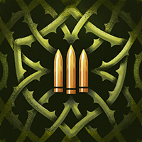
I guess Toxic Bullets (a tier 3 item) must be such an eyesore with that dark background, despite being a candidate for the single best designed icon to have came out of the item update.

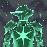
Or Escalating Resilience (another tier 3). My god, this don't even look like a weapon item, especially with all that green!
Here's a few example of items in the tier 3 vitality that does follow your design convention of a similar background color. Notice anything in particular?
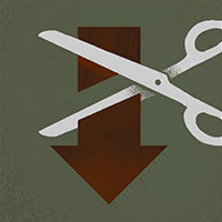
 (i will admit that this icon does radiate quite a bit of soul).

 (and it's literal gameplay counterpart for good measure)
They're obviously incomplete. Far more so than Toxic Bullets or any other visually goated icon.
My main point is that the items which don't follow this background trend, tend to be far closer to completion than items that do. In my opinion, the developers should focus on making visually appealing icons. Making every background the same flat color with a bit of photoshop noise because some internet guy hallucinated a pattern when there is plenty of evidence for the contrary is not a recipe for a well-designed icon.
As more and more items receive updates, you will slowly see the flat colors go away, in favor of visually appealing designs. We will have less debuff removers, and more toxic bullets as time marches on.
Similar threads
- Replies
- 0
- Views
- 34
- Replies
- 2
- Views
- 230
- Replies
- 0
- Views
- 48
- Replies
- 0
- Views
- 47
Share:
Members online
- Pharkhat.2004
- halomg
- pesquerart
- soicantry
- TimmyM
- 3v1l63n1us
- Zen_Azusa
- Valve
- Oleg-fav
- Queemo
- Ukie
- d1vio
- steventheeven3
- einar.elis.snorra
- zavt3r
- G33KZ0RD
- snipedassassin33
- Popiyaji
- jskky23
- Roo
- mrxlongshot
- fuchuzz
- yyuki11
- nathanieljbrill
- dominikloyola
- The Last Eagle Flies
- MadMann
- yakasovian
- Talon45
- Trax-_-
- ryder.seigle
- pvpmaster207.fb
- Etch
- photon
- Termiinal
- Arkolenn
- msokolov3
- Theatre
- octaviorios224
- HOTDOG26
- Lovely
- Goblin Man Sam
- Gingerale Grievous
- Schulterjohnny
- horchatascans
- doc.ochen
- undefuzer
- AndrewK
- fedev
- MetkiyPoVizovu
Total: 7,482 (members: 193, guests: 7,289)

