KumaraMoon
New member
(Reposted here from my FanArt post in the Deadlock Discord per suggestion)
Firstly, I really like that there is a new GUI rework
but tbh, after a few games these are my thoughts:
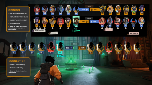
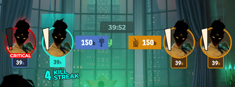
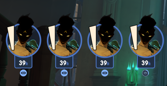
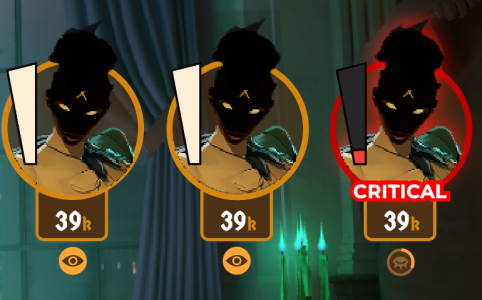
So I tried my hand at a variation that reduces those issues while also looking into keeping the color branding and most of the new rework parts. The rest of the new changes are really cool, like the "beatup" look when they are critical and such - the only issue is that in it's current visual state with the bright solid colors it is visually busy/bulky/distracting. I wasn't the only one to point it out. I was reviewing the changes with a group of friends who also play the game and they agreed and it's what prompted me to try out a visual suggestion.


Firstly, I really like that there is a new GUI rework
but tbh, after a few games these are my thoughts:
- The color is too bright and too visually distracting during gameplay
- I really do not think the Orange/black & Blue/white text color combo works well on the top HUD - its visually cluttered
- right now the solid colors makes it seem too bulky - but it works amazing for the overall branding for the new bosses in general and they look amazing! - just ..... not really good for the top GUI/HUD
- the not aligned/slight off center text for "critical" makes me have a visceral reaction as a designer
- some people have also said they may not be a huge fan of how far the top HUD drops down now when you press tab with it going really far down now with the item icons people buy but for me, it wasn't as huge of an issue tbh but I could see why it might be also a not that great for people who casually look at the scoreboard while running around on the map and it blocks more of their peripheral view
So I tried my hand at a variation that reduces those issues while also looking into keeping the color branding and most of the new rework parts. The rest of the new changes are really cool, like the "beatup" look when they are critical and such - the only issue is that in it's current visual state with the bright solid colors it is visually busy/bulky/distracting. I wasn't the only one to point it out. I was reviewing the changes with a group of friends who also play the game and they agreed and it's what prompted me to try out a visual suggestion.
