Batandy
New member
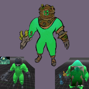
I know some people really like the features of the current Viscous design, despite being a placeholder, and don't like the supposed new design that's in the files, there's also people that feel the opposite way about this, so I kinda thought of combining the two designs together into this:

Turning the helmet into a scuba diver one fits the setting, it would also make sense as something Viscous himself perhaps has picked from the bottom of the ocean as makeshift armor, as it's rusty and all kinds of sealife grow on it.
I didn't play a lot with the body as I figure a key design of the hero being a literal mind controlled mass of goo, but I thought that keeping the glove and boots from the current ingame design help break the monotony a bit, and could be further exaggerated for better silhouette.
Of course, I don't wanna step on anyone toes at Valve's as I know you guys make some of the best designs in the industry, and I can't wait to see all the characters finished, but I thought I'd perhaps give you some additional ideas of where to take the design of this specific character.
EDIT: I realized I might have picked the wrong section for this, if the admins feel like it's more appropriate, please move it to Art Feedback - Viscous
Last edited:
