SardineS
Member
Ranks as they are currently.
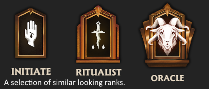
2. While colors for the last four ranks are good (bronze, silver, gold, magical) - colors for the first 7 ranks lack intuitive hierarchy.
3. Game engine could be leveraged to make higher rank materials more distinct. Color/materials for Oracle (4th highest) and Ritualist (7th highest) look too similar for immediate differentiation.
With the help of claude.ai I brainstormed some potential solutions for more hierarchical rank titles. Our final list was as follows -
2. Color Solution :
Two forms of progression - color warmth and material quality. Earlier ranks might typically display colder colors and simpler materials. Later ranks might display warmer colors and more metallic/magical materials. Currently, the first 7 ranks seem somewhat random in terms of color choice. Here are the above ranks with some attempt to apply visual hierarchy (with whatever tools are available on this forum).
(Putting colored text into an ordered list bugged out so it looks odd)
This is something that's harder for me to cook up on the spot, and will likely improve naturally with future iterations of Deadlock. Counter-Strike 2 currently does a good job of using shaders for differentiating various badges, and hopefully the same can eventually be done for Deadlock - as Oracle and Ritualist ranks can be difficult to distinguish at a glance. Materials could be a good solution to clearly differentiating between 'bronze' and 'dark orange.'

Issues to Address:
1. Certain rank titles seem arbitrary and lack intuitive hierarchy.
2. While colors for the last four ranks are good (bronze, silver, gold, magical) - colors for the first 7 ranks lack intuitive hierarchy.
3. Game engine could be leveraged to make higher rank materials more distinct. Color/materials for Oracle (4th highest) and Ritualist (7th highest) look too similar for immediate differentiation.
Suggested Solutions:
1. Title Solution :With the help of claude.ai I brainstormed some potential solutions for more hierarchical rank titles. Our final list was as follows -
- Initiate (Kept from original).
- Apprentice (Replaces "Seeker").
- Acolyte (Replaces "Alchemist").
- Adept (Replaces "Arcanist").
- Arcanist (Moved from position 4 to 5).
- Master (Replaces "Ritualist").
- Archon (Moved from position 7 to 8).
- Oracle (Moved from position 8 to 9).
- Ascendant (Replaces "Phantom").
- Ethereal (Replaces "Ascendant" position).
- Sovereign (Replaces "Eternus").
2. Color Solution :
Two forms of progression - color warmth and material quality. Earlier ranks might typically display colder colors and simpler materials. Later ranks might display warmer colors and more metallic/magical materials. Currently, the first 7 ranks seem somewhat random in terms of color choice. Here are the above ranks with some attempt to apply visual hierarchy (with whatever tools are available on this forum).
(Putting colored text into an ordered list bugged out so it looks odd)
- Initiate.
- Apprentice.
- Acolyte.
- Adept.
- Arcanist.
- Master.
- Archon.
- Oracle. (Bronze Shiny Material)
- Ascendant. (Silver Shiny Material)
- Ethereal. (Gold Shiny Material)
- Sovereign. (Magical Shiny Material)
This is something that's harder for me to cook up on the spot, and will likely improve naturally with future iterations of Deadlock. Counter-Strike 2 currently does a good job of using shaders for differentiating various badges, and hopefully the same can eventually be done for Deadlock - as Oracle and Ritualist ranks can be difficult to distinguish at a glance. Materials could be a good solution to clearly differentiating between 'bronze' and 'dark orange.'

Attachments
Last edited:


