jinijin1337
New member
Good day!
I know is is more gameplay and UI focused but since these have something to do with the Shop and items, I figured to put it here. I know one day Valve will implement some of these into the game, but I want to put this up here in hopes that they can implement it sooner or take some ideas from it. Anyways, without further ado, here are my ideas and suggestions for the Curiosity Shop.
1. Shop UI Tweaks
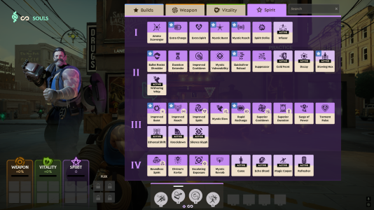
- Tabs on top have a more consistent size (They're currently not the same, yeah, OCD triggered)
- Souls Costs are replaced by Tier numbers (as items in the same tier don't have the same price anyways due to components)
- Current Souls moved to top left (space will be utilized later). We don't really need the "Esc to go back" button and "The Curiosity Shop" name, we already kinda know that.
2. Improved Tooltips and the Ability to "Mark as Quickbuy"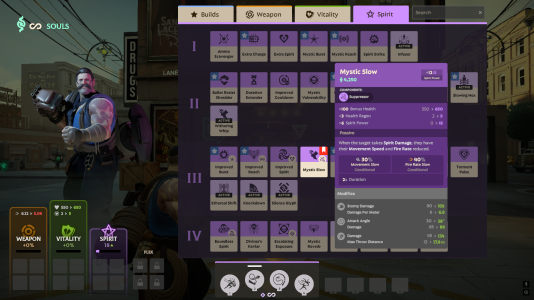
- Item tooltips are more compact and are merged into one; modifiers are easier to read.
- Stats changes from items are also shown at the bottom left.
- Implement the ability to mark an item for "Quickbuy"
- Right click an item to mark it.
- Bind a key to quickly buy what's in your Quickbuy without opening the shop UI.
3. Shop Item Callouts
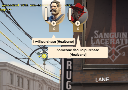
- Communication is key to a game like Deadlock and we can already callout enemy items, so why not for shop?
- Alt + Left Click = Purchase Request
- Shift + Left Click = Self Purchase Callout
4.1. Toggleable Compact UI
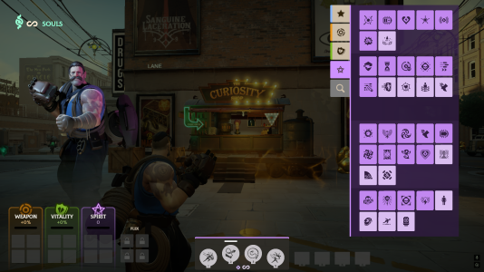
- For advanced players who know which items are which.
- Toggleable setting to switch from the big UI to the compact UI.
- I had this idea from Dota 2 where the item shop is on the right.
- More visibility. (Have you ever had the moment where you're in the secret shop then all of a sudden someone stands right next to you and you panicked because you thought it's an enemy? No? Just me? Okay. But I wanna see what's around me.)
4.2. Pinnable Builds
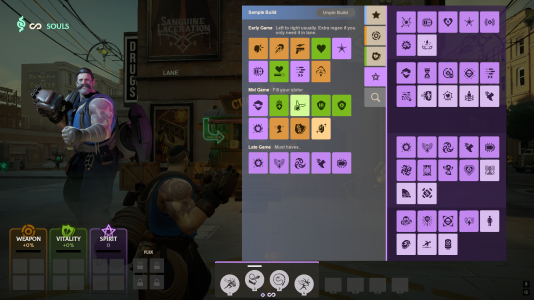
- Along with the Compact UI, have the ability to pin the build menu so you can navigate the other item tabs without losing sight of your build/guide.
- Can be unpinned, of course.
__________________________________________________________________________________________________________________________________________________________________
And these are the changes I would like to have in Deadlock. What do you guys think?
I know is is more gameplay and UI focused but since these have something to do with the Shop and items, I figured to put it here. I know one day Valve will implement some of these into the game, but I want to put this up here in hopes that they can implement it sooner or take some ideas from it. Anyways, without further ado, here are my ideas and suggestions for the Curiosity Shop.
1. Shop UI Tweaks

- Tabs on top have a more consistent size (They're currently not the same, yeah, OCD triggered)
- Souls Costs are replaced by Tier numbers (as items in the same tier don't have the same price anyways due to components)
- Current Souls moved to top left (space will be utilized later). We don't really need the "Esc to go back" button and "The Curiosity Shop" name, we already kinda know that.
2. Improved Tooltips and the Ability to "Mark as Quickbuy"

- Item tooltips are more compact and are merged into one; modifiers are easier to read.
- Stats changes from items are also shown at the bottom left.
- Implement the ability to mark an item for "Quickbuy"
- Right click an item to mark it.
- Bind a key to quickly buy what's in your Quickbuy without opening the shop UI.
3. Shop Item Callouts

- Communication is key to a game like Deadlock and we can already callout enemy items, so why not for shop?
- Alt + Left Click = Purchase Request
- Shift + Left Click = Self Purchase Callout
4.1. Toggleable Compact UI

- For advanced players who know which items are which.
- Toggleable setting to switch from the big UI to the compact UI.
- I had this idea from Dota 2 where the item shop is on the right.
- More visibility. (Have you ever had the moment where you're in the secret shop then all of a sudden someone stands right next to you and you panicked because you thought it's an enemy? No? Just me? Okay. But I wanna see what's around me.)
4.2. Pinnable Builds

- Along with the Compact UI, have the ability to pin the build menu so you can navigate the other item tabs without losing sight of your build/guide.
- Can be unpinned, of course.
__________________________________________________________________________________________________________________________________________________________________
And these are the changes I would like to have in Deadlock. What do you guys think?
